
Browse the Manifest help
Telling your story
Editorial, Statement, Story, Page tabs, Image steps, Lookbook, Before and after, Video, Journal, Gallery, Ingredients and Flexible section: sections for words and pictures.

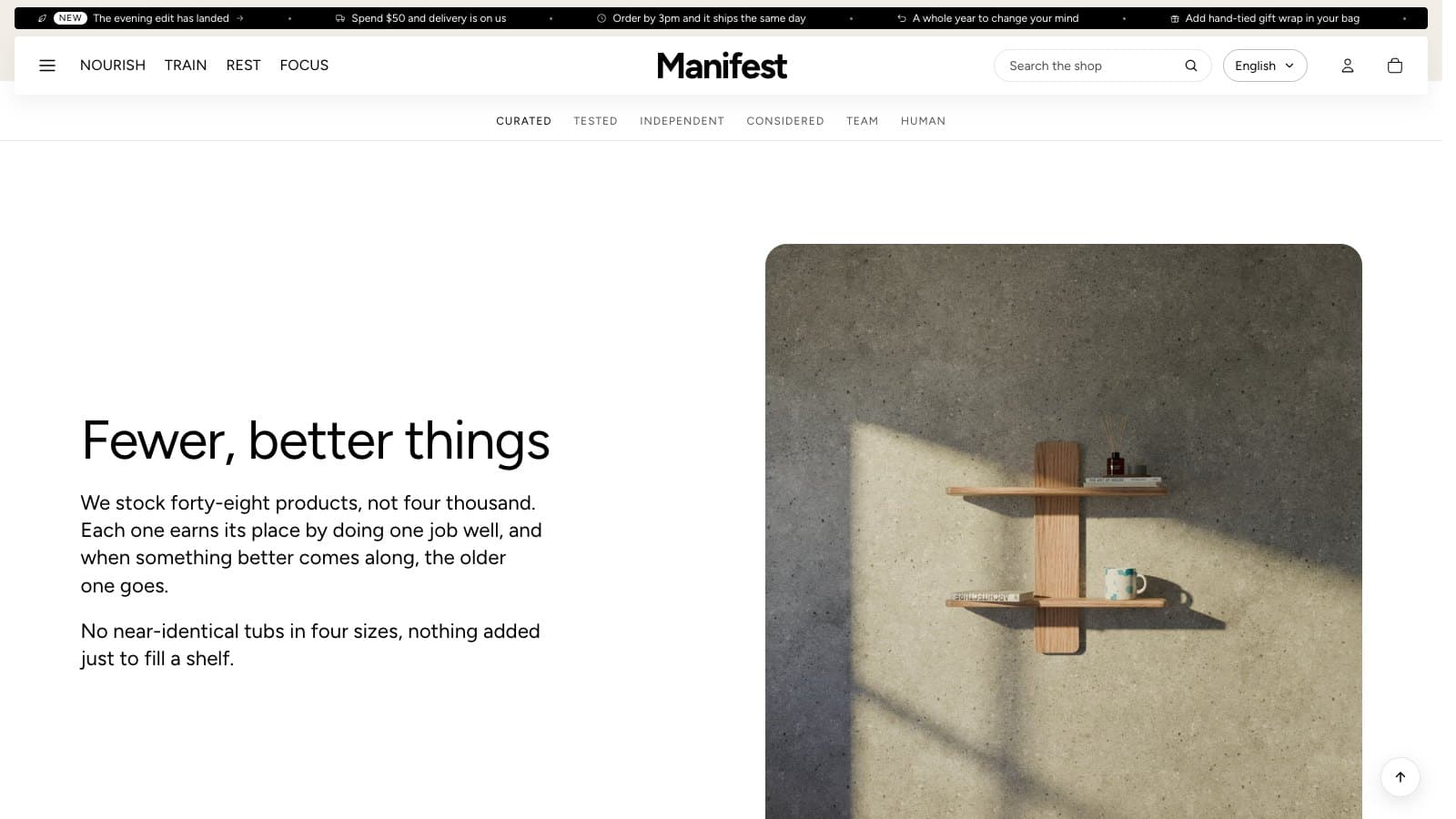
Editorial
A heading and a few lines, with an optional button and a checklist of short points. The heading can use the Serif display style.
Statement
Two lines at display size, the first from the left and the answer from the right. Good for a brand promise between busier sections.
Story and Page tabs
A Story is one chapter of a long page: heading, text and a photograph beside it (either side) or wide above it. Alternate color schemes to set chapters apart.
- Give each Story an Anchor, a short word such as curated.
- Add a Page tabs section at the top of the page, with a tab block for each chapter using the same anchor.
- The tabs stick under the header as the visitor scrolls and mark the chapter they are reading. A floating button can follow them down the page.
Image steps
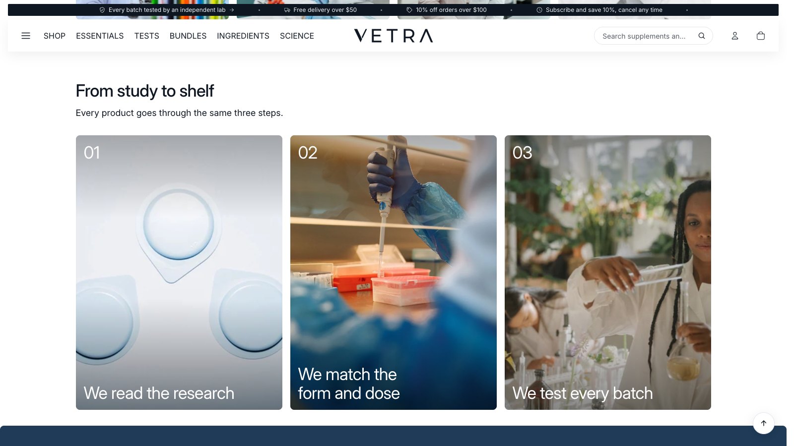
Three or four numbered picture panels that explain a process, such as how you choose products. They swipe on phones and sit in a row on larger screens. The heading above them takes alignment, bold and italic, highlighted words, its own colors and the Typewriter effect. Heading alignment starts at Heading left, text right. See Showing collections and products, under Section headings.
Lookbook
One photograph with up to eight hotspots, each tied to a product. Choose the image first, then place each hotspot with the Across and Down settings.
Before and after
Two photos of the same framing with a handle to slide between them, operable by mouse, touch and keyboard. Set the starting position and the shape.
Video
An uploaded video, or a YouTube or Vimeo link. Uploaded videos can instead play muted on a loop with a pause button. Add a cover image to show before it plays.
Journal
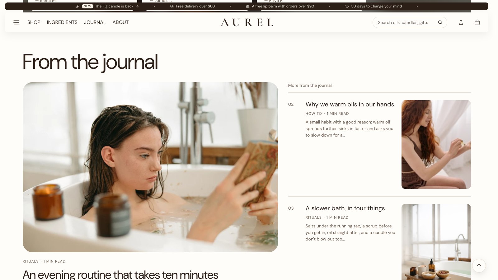
Your latest blog article as a large card, with a numbered list of the next ones beside it. On computers the list is as tall as the lead story: its entries share that height evenly, each with a tall picture and a line from the article.
- Text and link position: Below (the default) puts the section's text and the link to your journal under the stories, as a thin row with a rounded link. Above puts them beside the heading.
- Articles in list (0–6): set it to 0 to show only the newest article.
- Heading font, Heading size, Image shape and Heading above the article list.
Gallery
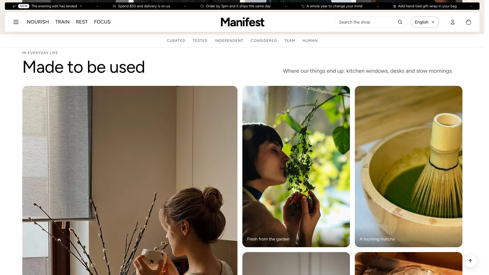
Up to five photos, such as customers or your team using what you sell, under a heading, a few lines and an optional button. Add one Photo block per picture. Each photo can have a Caption and a Link.
- Layout: Mosaic, first photo large shows the first photo big with the others beside it. Row puts the photos side by side at the same size. With only one photo, it shows as a row.
- Image shape: Portrait (4:5), Square (1:1) or Landscape (4:3). It is used for the row, and for every photo on phones. The mosaic fills its own frame on computers.
- On phones the photos scroll sideways, one and a bit at a time, so shoppers can see there is more.
- Link name for Page tabs: a short word, so a tab in Page tabs can jump here.
Ingredients
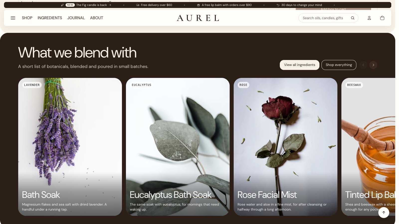
A row of tall cards, one per ingredient, like a studio photo of each thing that goes into your products. The row runs past the edge of the screen, so the next card always peeks in. Shoppers move it by swiping, with a trackpad, or with the arrows at the top of the section.
- In the theme editor, click Add section and choose Ingredients.
- Fill in Small text above heading, Heading and Text. Add up to two buttons with Button label and Button link, and Second button label and Second button link. The second one is an outline button.
- Add an Ingredient block for each ingredient, up to twelve. Choose its Image: a portrait (3:4) studio photo on a plain background works best.
- Type the Ingredient name. It shows on a small tag on the photo. Heading and Text sit at the foot of the card, such as what it does and where it comes from.
- Add a Link to open the product the ingredient is in, or a page about it.
The section works with any Color scheme. For ingredients shown on a product picture with dots, use the Product story section instead: see Product story and ingredients.
Flexible section
Build your own section from blocks: Text (a heading, a small label or a paragraph), Buttons, Images and Groups that hold blocks in a column or a row. Choose One column or Two columns on computers, Page width or Narrow, and the space between blocks. It's also where Sidekick's new blocks go: see Make new blocks with Sidekick.