
Browse the Manifest help
Color schemes
Build a palette once and give it to any section, card or panel. The first scheme colors every page.

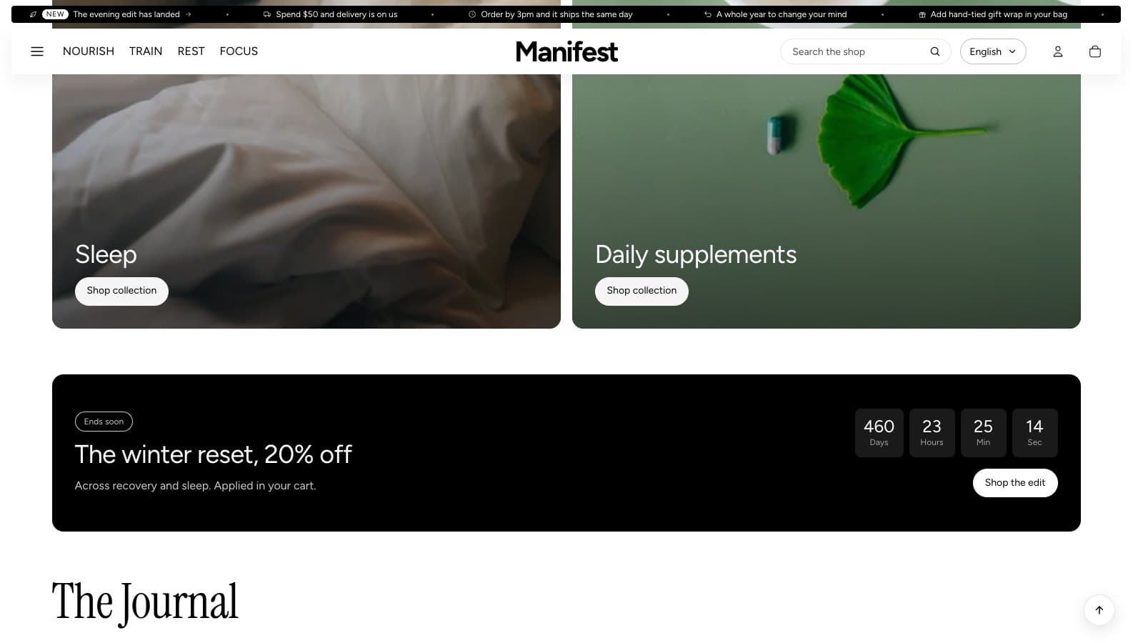
A color scheme is a named set of colors. Manifest ships with six, from white and soft gray to black, warm stone, sage and deep forest, and you can edit them or add as many as your brand needs in Theme settings → Colors.
The palette
Theme settings → Colors starts with a palette: the ten colors the theme is built from (white, black, ink, stone, sand, sage, forest, mist, slate and line). Every color picker in the editor offers them at the top, so the same green is one click away in any section. The starter schemes take their colors from the palette, so changing a palette color changes every scheme that uses it. You can rename, recolor, add or remove palette colors; when you remove one, Shopify asks which color replaces it wherever it was used.
What a scheme holds
- Background, or a Background gradient, which replaces the background color when set.
- Text and Secondary text (brand names, descriptions and other supporting details).
- Dividers: the hairlines between rows and around inputs.
- Cards and panels, with Text on cards and panels: the color of product image panels, tabs, chips and small cards inside a section.
- Primary button and Primary button label.
Where schemes are used
- Every section except the Hero and Slideshow, which sit on photographs, has a Color scheme setting, including the header, footer, announcement bar, cart drawer and popup.
- Some cards and panels take their own scheme, separate from the section around them: the open card of a FAQ, testimonial cards, the countdown panel, People cards panels, and menu and grid promos when they have no photo.
- The first scheme is the page. Edit it to change the whole store at once. A section on any other scheme becomes a rounded, edge-to-edge band of its own color, with its content kept to the page width.
Words over photos
Text, buttons and slider controls laid over photographs use the two colors under Over photos (Text on photos and Photo overlay), whatever the section's scheme, so they stay readable on any picture.
Keep it readable
- Keep Text and Secondary text at a contrast of at least 4.5:1 against the background, and the primary button label at least 4.5:1 against the button.
- The six starter schemes meet these. If you change them, check with a contrast checker before publishing.
- On a dark card color, product photos are shown as shot rather than blended into the card, so a product is never darkened.