
Browse the Manifest help
Product page
Build the product page from blocks: price, options, buy buttons, stock, badges, size chart, accordions, tabs and more.

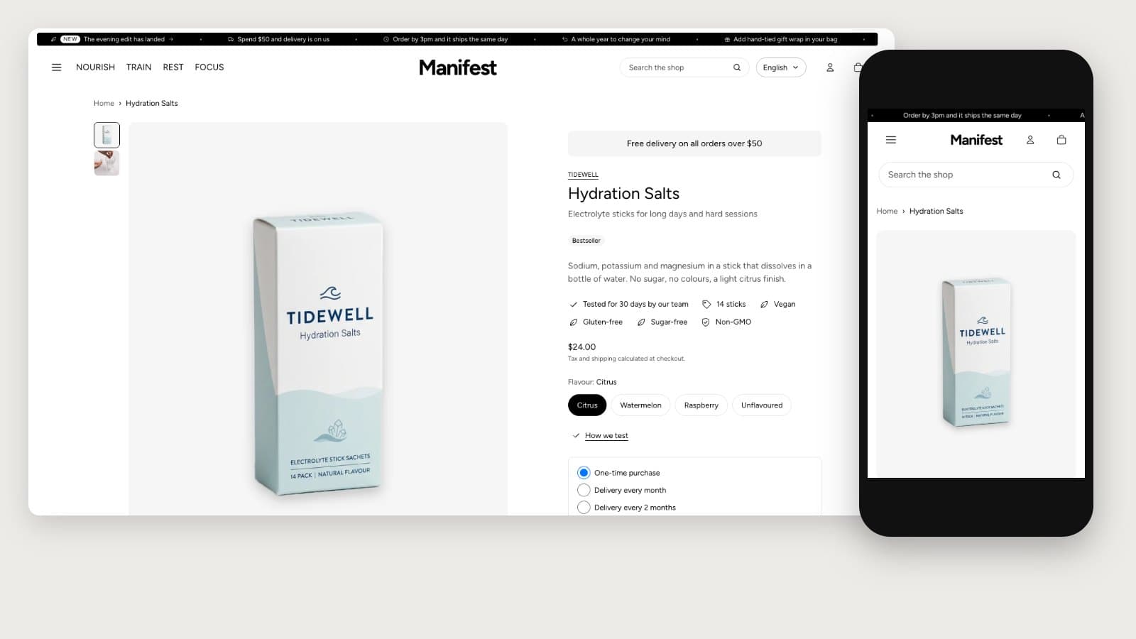
The product page is one section made of blocks you can reorder, repeat or remove. Changes apply to every product using the template; create more templates for different kinds of product.
Section settings
- Show breadcrumbs, Open images full screen, and Show sticky add-to-cart bar (a slim bar that follows the visitor once the main button scrolls away).
- The gallery shows every photo and video of the product; choosing an option moves to that variant's image.
- Layout on large screens: One at a time (a slider with thumbnails), All in one column, or All in two columns.
- Image width on large screens, Image shape, and Thumbnails (beside the images, below them, or hidden).
The blocks
- Vendor, Title (with an optional star rating from a reviews app), Subtitle (one line under the title, from Shopify's Product subtitle field unless you type your own), Summary (the first words of the description), Price (with an optional tax and shipping note), Notice, Text.
- Badges: the product's sale, sold-out and own badges, the same as on its card.
- Icons with text: up to six short lines with an icon each, such as Vegan or Third-party tested. Connect each line to a product metafield and it shows only on products that have a value. Under From the product's details, tick Add dietary preferences, Add certifications and Add allergens to add a line for each one ticked in the product's category details.
- Product details: a list of the product's category details, such as Dietary preferences, Allergen information or Material, as a List or Rounded tags. Details to leave out hides any by name. See Product details with no setup.
- Info popup: a link or button that opens a panel with a heading and text or a page, for dosage, lab results or delivery details.
- Variant picker: buttons for each option, or dropdown menus with Show options as. Options that use Shopify's color swatches keep their swatches.
- Buy buttons: quantity selector, express checkout buttons, a back-in-stock form for sold-out variants (off to start with; turn on Show back-in-stock form, and requests arrive as contact messages), and a recipient form for gift cards.
- Stock: a count when stock runs low (you set the level) and an availability note, such as your dispatch time.
- Delivery estimate: when an order placed now should arrive, such as Arrives Thu 2 Oct – Mon 6 Oct, and, if you like, the time left to order for dispatch today. It's worked out from your settings in your store's time zone: Order cut-off hour, Days to prepare an order, Fastest and Slowest delivery in working days, Ship on weekends, and Days you don't ship. Add a Delivery cost line and a Returns line with a link. It hides for sold-out and pre-order variants. Keep the settings in line with your shipping rates so the estimate stays true.
- Complete the set: the products that go with this one, from the complementary products you set in the Search and Discovery app, each with a checkbox and the total, and one button that adds them all with this product. It stays hidden for products with none.
- Pickup availability, for stores with local pickup.
- Trust badges: up to four icons with short lines under the buttons.
- Countdown: a timer to a date, such as a sale's end. It starts with no date, so set one for it to show.
- Size chart: a link that opens a page of your choosing in a panel.
- Description (as an accordion or plain, with the product's Care guide field below it when it has one), Accordion blocks (text, a page, or a product metafield such as ingredients), and Tabs.
- Quick order list: every variant in rows with its own quantity, for ordering several at once.
- Buy both: a pairing with a recommended product, bought together.
- Disclosures: the product's safety and compliance notices, such as a Prop 65 or choking hazard warning, word for word. Add them in Shopify on the product, under Disclosures; the block lists every title (with its symbol) on one line and opens to the full text. It shows nothing on products without any, so it can stay in the template. Each disclosure's Display preferences decide whether it also shows in the cart.
- Share, Follow on Shop, Custom Liquid, and blocks from apps.
When something is sold out
When the chosen option is sold out, up to three similar products that are in stock appear under the buttons, from Shopify's related-product recommendations, so the page still leads somewhere.
Sticky bar and moving between products
The sticky add-to-cart bar names the option being added, such as Moss or 300 g, with Change to go back to the options. When a shopper arrives from a collection, Previous and Next links beside the breadcrumbs step through that collection's products (Show previous and next product, on by default).
Combined listings
With Shopify's Combined Listings app (Shopify Plus), products sold separately, such as one product per color, show as one product with an option. Picking a value that belongs to another product swaps that product in on the page, without loading a new one: the address bar and the back button follow, and the other sections stay where they are.
Subscriptions and pre-orders
Products sold on selling plans (subscriptions, pre-orders) show their plans as choices above the buy button. A plan that charges part now says what's paid today and what's paid later. See Set up subscriptions.
Below the product
Related products (from Shopify's recommendations), Product reviews (a home for a reviews app's block) and Recently viewed follow the product section.