
Browse the Manifest help
Getting started
Image sizes and focal points
The picture sizes each section expects, and how to keep the subject in frame on phones.

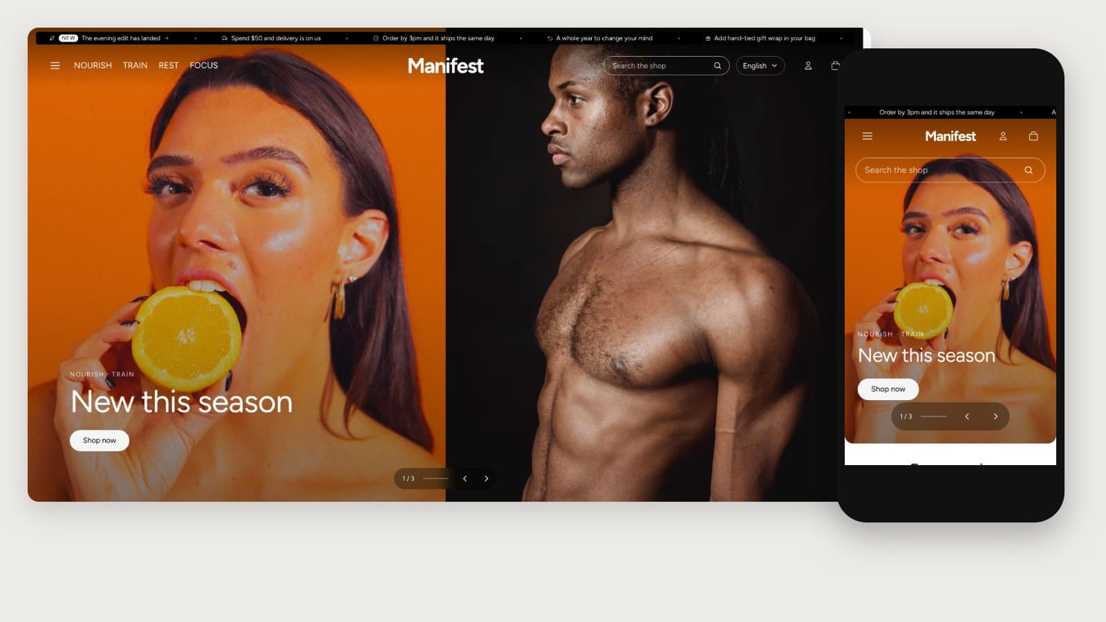
Every image setting in the editor states its suggested size under the field. The common ones:
- Hero, one image: landscape 16:9, 2880 x 1620 px. Two images side by side: portrait 4:5, 1600 x 2000 px each.
- Slideshow: landscape 16:9, 2880 x 1620 px.
- Collection tiles, promo panels, menu promos, People cards: portrait 4:5, 1600 x 2000 px (1200 x 1500 px is enough for tiles).
- Image steps and Collection list: portrait 3:4, 1500 x 2000 px.
- Story: square 1600 x 1600 px beside the text, or 2400 x 1200 px for the wide layout.
- Promo banner background: landscape 2:1, 2400 x 1200 px.
- Logo: about 600 x 200 px, a transparent PNG or SVG.
Focal points
Phones crop wide pictures at the sides. In Content → Files, open an image and set its focal point on the subject: every section that crops the picture keeps that point in view.
TipUpload photos at the suggested size or larger. Shopify serves each visitor a copy sized for their screen, so large originals do not slow the page.
Small pictures stay small
Small pictures, such as collection chips, avatars, icons, logos and the cards in menus, load at the size they show on screen, with a sharper copy for high-resolution screens. The header logo loads at the size you set with Logo width. There is nothing to set: upload one good file and the theme picks the right size for each visitor.