
Browse the Manifest help
Header and menus
Logo, main menu, dropdowns with promo cards, the account menu, and the country and language selectors.

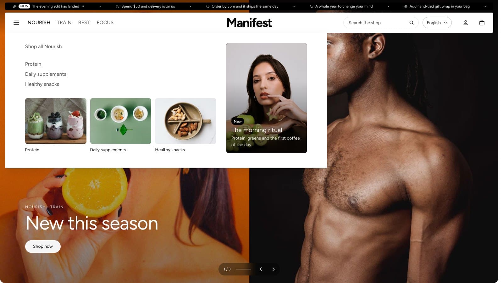
Logo and menu
- Logo: a transparent PNG or SVG about 600 x 200 px, and Logo width (60–240px). Without a logo, the store's name is shown.
- Menu: choose the menu from Online Store → Navigation. Items with sub-items open a dropdown on computers and a sliding drawer on phones.
- Menu links that don't fit fold into the menu button. On computers, when the links don't fit beside your logo or shop name, they move into the menu drawer and the menu button appears. This happens by itself, for any name, font or number of links. Make the window wider, or use fewer or shorter top-level links, to bring them back.
- Uppercase menu links for a more formal look.
- Customer account menu: the links in the account dropdown. Leave it empty for Shopify's standard ones.
Menu drawer
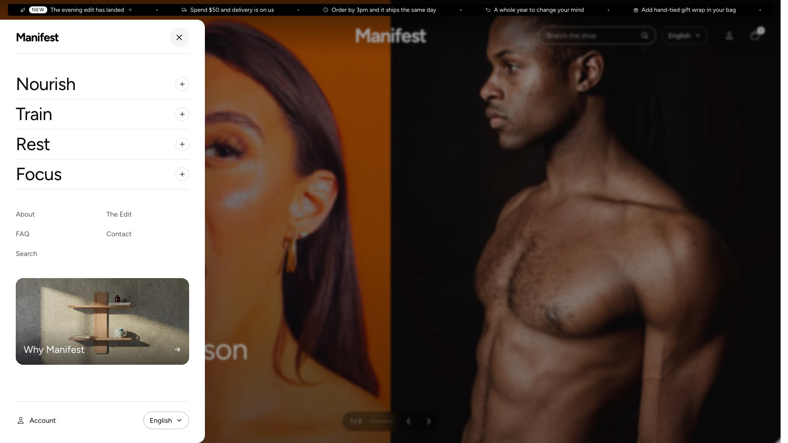
The menu button opens a drawer from the side. It is the menu on phones, and on computers when the links fold into the button. It dims the page behind it and shows your logo, then your menu links in large type with a line between them. A link with sub-items opens in place, with a Shop all link first and a small picture beside each collection or product. When the menu item itself is called Shop, the first link reads View all. A menu promo you set for that item shows there too.
To set up the rest of the drawer, select the Header section in the theme editor and scroll to Menu drawer:
- Secondary menu: smaller links under the main ones, such as help, contact and about. Create the menu in Content → Menus first.
- Feature image, Heading and Link: a picture card at the foot of the drawer. Add a Heading to show it over the picture. With a Heading and no picture, the card shows on a plain background. Leave Link empty to link to all products.
The foot of the drawer has an Account link, when customer accounts are turned on in your store, and the country and language pickers when Show country/region selector or Show language selector is on. On larger screens the drawer opens below the announcement bar.
Menu promos
Add a Menu promo block to show a picture card inside a dropdown. Menu item must match the title of a top-level menu item, such as Nourish (capitals do not matter). Without a photo, the card takes its own color scheme.
Over the hero
When a page opens with a hero, the header floats transparent over it with light text, and turns solid as the visitor scrolls. Elsewhere it sits on its own color scheme. Turn off See-through over the first section to keep the header solid and place the hero below it.
While the header floats over a photo, your logo shows in pure white, whatever its colors, so it reads on the photo. When the header turns solid, the logo goes back to its own colors. Upload your usual logo; you don't need a white version for the header.
Sticky header
- Always: the header stays at the top as visitors scroll.
- Only when scrolling up: it slides away on the way down and comes back as soon as the visitor scrolls up, leaving more room for products.
- Off: the header scrolls away with the page.
Country and language
Show country/region selector and Show language selector add pickers to the header. They appear only when the store sells to more than one country (Settings → Markets) or has more than one published language (Settings → Languages).
Menu pictures
Pictures in menus decides what dropdowns show beside their links: Collection pictures (for links to collections), Products (the first three products of the collection a top-level item links to, with prices) or None. With a mouse, dropdowns wait a moment before opening and closing, so crossing the bar doesn't make them flash; with a keyboard they open at once.