
Browse the Manifest help
Showing collections and products
Collection tiles, Collection list, Range tabs, Featured collection, Featured product and Promo panels, and when to use each.

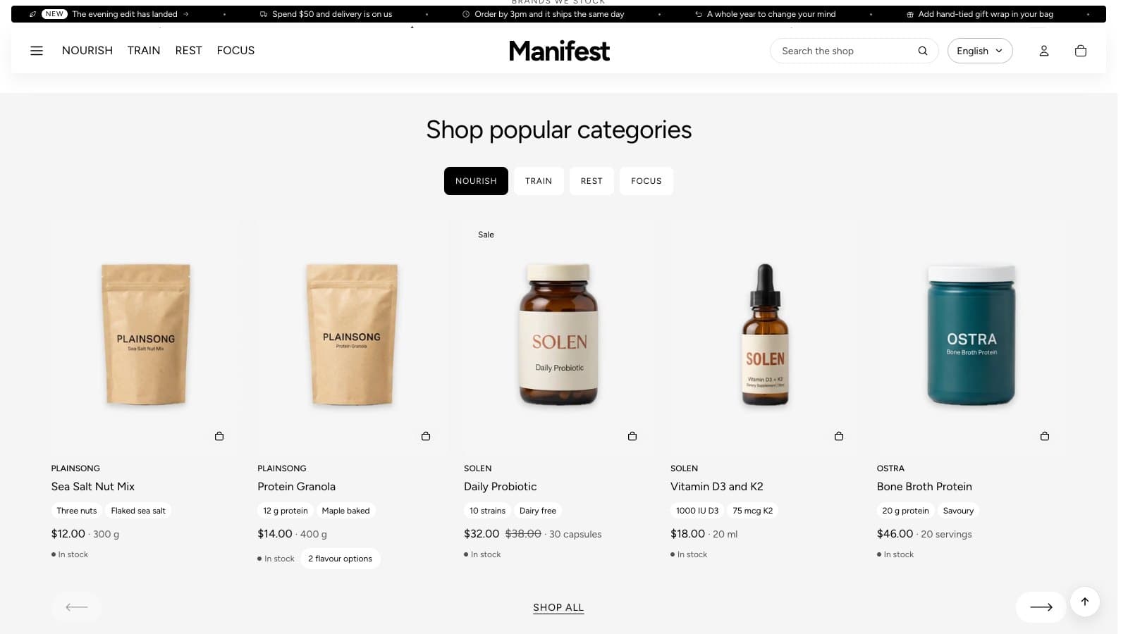
Collection tiles
Up to eight photographic tiles, each opening a collection, with a heading and a line of text underneath. Each tile takes the collection's own image unless you upload one, and its title unless you type one.
- Heading position: Above puts the section's heading and text over the tiles (the default). Below puts them under the tiles.
- Heading alignment starts at Center. See Section headings below for the other choices.
- Columns on large screens (2–6) and Columns on phones (One column or Two columns).
- Image shape: Portrait (4:5), Square (1:1), Landscape (4:3) or Same as the image.
Tiles never leave one tile alone on the last row. On computers, one leftover tile joins the row instead: five tiles at 4 columns show as five across. This works for up to six tiles. On phones with two columns, an odd last tile fills the whole row.
Section headings
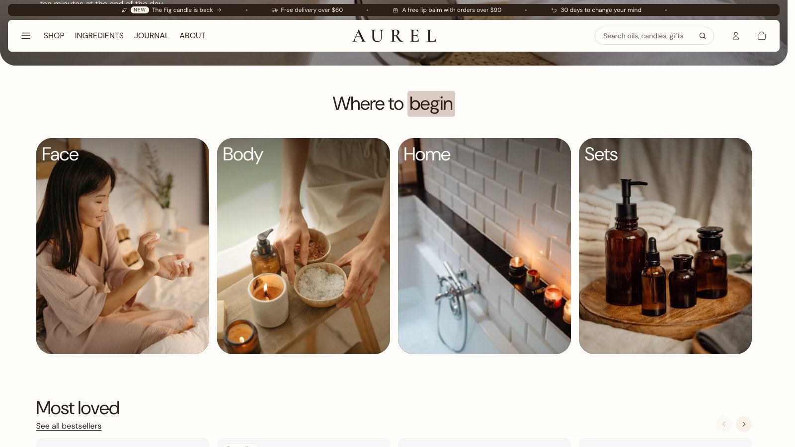
Collection tiles, Image steps and Team share the same heading settings. In the theme editor, select the section. The settings are right under Heading and Text.
- Heading alignment: Heading left, text right; Left; Center; or Right.
- Bold and italic: select words in the Heading box and use the B and I buttons in its small toolbar.
- Highlight words: wrap them in square brackets in the Heading, such as Where to [begin]. Highlight style sets how they look: Color, Marker (a band of color behind the words) or Underline. Highlight color sets the color. Leave it empty to use the color scheme's accent.
- Heading color and Text color: leave them empty to use the color scheme.
- Heading effect: Typewriter types the heading out, letter by letter, the first time it scrolls into view. It keeps bold, italic and highlighted words. Screen readers and search engines always get the whole heading.
Collection list
A larger list of up to twelve collections as tall cards, for stores with many categories.
Range tabs
Collections as tabs above a row of products, so a visitor can switch between ranges without leaving the page. Up to twelve tabs; each shows up to 16 products with arrows to scroll and a link to the whole collection. The products are the same product cards as everywhere else, with Show short facts adding each product's facts as pills and its pack size beside the price.
- Label: leave empty to use the collection's title.
- Show brand: the product's vendor above its name.
- Short facts and pack size: each card can show up to two short facts, such as 500 mg sodium, and a pack size, such as 14 sachets. Create two product metafields in Settings → Custom data → Products: Specs (list of single line text) and Pack size (single line text). Then fill them in on each product, under Metafields at the foot of the product page in admin. Older spec: and size: tags still work.
- Color scheme: match the ground your product photos were shot on, so they sit on it without a visible box.
Featured collection
A row of product cards from one collection, with a heading and an optional subheading that links to the collection. Shows 2–12 products; all products are used until you pick a collection.
Featured product
One product with its gallery, options and add to cart, anywhere on a page. Text defaults to the start of the product's description. Show dynamic checkout button adds Shop Pay and other express buttons; they add weight to the page, and the product page and cart always show them anyway.
Promo panels
Two to four tall photographic panels with a heading, text and a button, each linking to a collection or any page.